Mero Saathi ko restaurant
"pink rupee....ha ha ha ha ha"
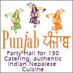
'Pink Rupee Curry House'.......thats the most bizare name i ever heard for a restaurant......change that name.
It is one of the oldest restaurant in London but without any website so at his request I gave it a go with goolgepages
Paanch rupiya ko note pink cha ni tyasai ko theme liyera banayeko ho. Menu ma pani paanch rupiya ko photo cha tara menu ma kehi thapnu parne cha ki bhanera sodheko kasaile comment diyena
Bholi pheri herchu kehi recommendation aaucha ki
Khoi no suggestion about menu???
not about menu pal...but the layout looks like that of cheap porn sites...

i like the name
menu also looks good maybe add more chats like samosa chat pani puri chat etc
there are also some spelling mistakes(or maybe thats the way to spell so that its easier for british ppl i am not sure)
have more sweets. maybe even offer some south indian dishes.
First of all I would like to thank Gundaa for the suggestions. They do samosa chats there but only at special requests so I didn't include it in the menu but pani puri is bit difficult to do in restaurant but recently they have started doing momos and would include it if it becomes a hit.
As for lamopuri, would you like to share that p*** site that you frequently visit so that I can compare it to the one that I have made. Do remember that I am an accountant in a share trading company and that I was just helping my mate with free website that I enjoy building in my free-time.

"10% Discount On Take Aways (Collection Only)"
Take Aways = Take Outs
Unles you say Take Aways in London? Hm...
What do you mean by (Collection Only)? Hm... Group Take Outs?
---------------------------------------------------------------------------------------------
Why do you have useful websites right at the beginning of the page on the home page? It looks very unprofessional, especially that you are trying to present and represent the restaurant via website. Does it have to be at that spot?
---------------------------------------------------------------------------------
Opening 7 days a week should be the LEAD. It should be at the spot where the useful websites and the google search is right now.
----------------------------------------------------------------------------------
Information on this website is just a general guide and are subject to change without notice
"Information on this website is just a general guide and are subject to change without notice" It comes out threatening, like a government disclaimer etc. People who will visit your friend's website are doing him a favour by visiting the site, so you should be encouraging them to visit it more often, and not chase them away. Maybe I read it a wrong way. But when I read it, I don't really want to waste my time to look at the site again, unles I have been to that restaurant several times and it's my fav. restaurant. Even then what the heck "change without notice,"
Maybe you could say the same message in a more genler way? "Please visit us regularly to check new additions in our menu and news," Hm...?
---------------------------------------------------------
Font size, chosen font and the spaces between the sentences need a major makeover. Make it look professional, since it's a business website. Is there a need to have a single space between the sentences? Right now to me it looks hodge podge and disorganized. I shouldn't be organizing the information to read it, the creator should organize it for his/her audience.
-----------------------------------------------------
And the advertisements should be at the bottom of the page maybe??? You are trying to advertise your friend's business first, not the neighbours'.
--------------------------------------------------------
Open 7 days a week should be on the top of the page after the delivery message, and then the contact information should be right there below it, and not on the side.
telephone
street address
------------------------------------------------------
You can also include printable menus on the website.
------------------------------------------------------
Always remember less is more. So, make it simple for your customers.
Visit other good renowned restaurants' websites to get an idea. See how they have presented their restaurant via web. You'll get an idea.
You need to work lot more on you site to make it look posh. And, also do spell check and grammar check as the site represents your friends' restaurant and technically his image as well. I'm sure he would like to be represented well.
------------------------
Good luck. For a starter, you are headed in a right direction.

Thanks a lot Mr. Sigh. I will make the necessary changes. Regarding the confusion between take outs and take aways, we do call it take aways in London. Collection only means no discount for home delivery. It is easily understood here in UK. Maybe its the use of English in UK and US that is creating the confusion, like you guys call our crisps=chips and chips=fries. Apart from different ways of spelling Asian food, which isn't a mistake, I don't suppose there is any spelling error. I would have been better off posting the advise on British-Nepalese website for discussion but couldn't think of any.
Disclaimer is used as another friend of mine had a legal problem with a customer because he didn't update his restaurant with changes that he had in his menu.
Printable menu is a great idea.I think I have enough suggestions to make the website good enough, however as I said since the website is free, I don't have much options to make it look posh as it doesn't allow me to add stuffs external to google's own provisions. Anyways thank you all very much and I really appreciate whoever have contributed to this thread.
I'm not a big fan of the colors used in the website. makes the website look very cheap. even with a basic layout, the colors and fonts used can make a big difference.
i'd suggest not using such bold pink at the very top! and then there's the unused space before the content begins. and why not have the 'useful websites' link and the google customsearch at the side?
the one good thing is it's easy to navigate. but design needs work. you don't need flashy signs, with so little text, people will read most of what's there anyway.
not a good idea to have google adsense on business/resturant website.
You are trying to promote your/friend's business--
If this is one of the oldest resturant then I think the owner should have better knowledge about the menu than asking us.
But if you are asking about the layout of the website then you should not consider doing with googlepages or similar (geocities).
Good Luck.
Please log in to reply to this post
You can also log in using your Facebook

You might like these other discussions...